Jiahui Yu’s Reflective Journal

In this reflective journal, I will use the DIEP strategy to evaluate my four projects in semester 1.
Describe
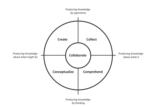
Four projects in semester 1 worked through the 5C design model: Collect, Comprehend, Conceptualize and Create.
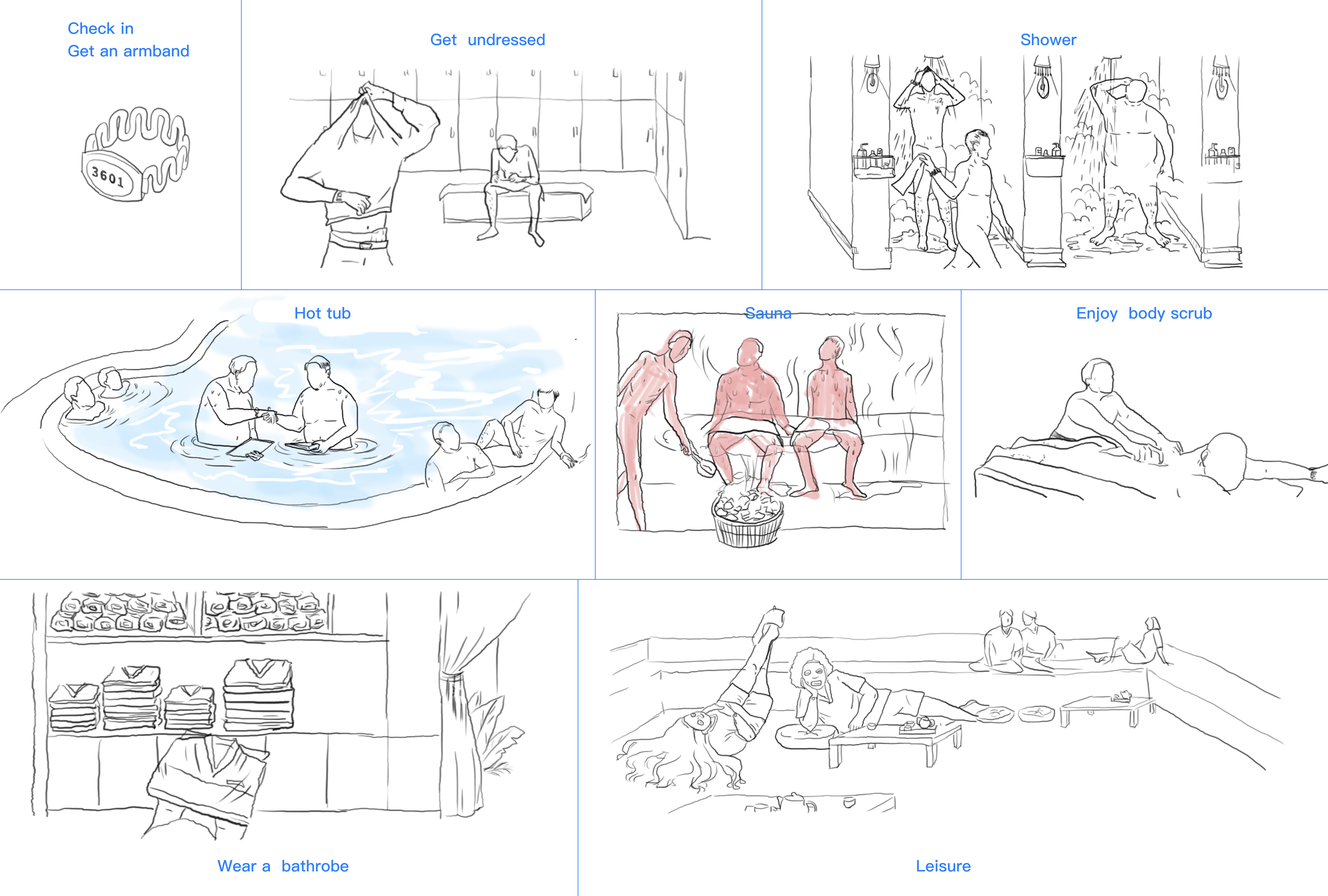
The first project focused on understanding and enriching the user experience. The most surprising insight I realized is that the most valuable persona is young families (children are generally under 7 years old). Before this user research, I didn’t even know the type of role existed. I then used three different user modelling techniques ( Personas, User journey and Storyboard) to clarify my user research.
Project 2 focused on finding potential solutions. I generated no less than 10 ideas for the street safe problem and sketched out two of them in a more elaborate way. In this project, I was able to generate a large number of ideas, most of which did not work. In the end, I did my best to push for 2 solutions.
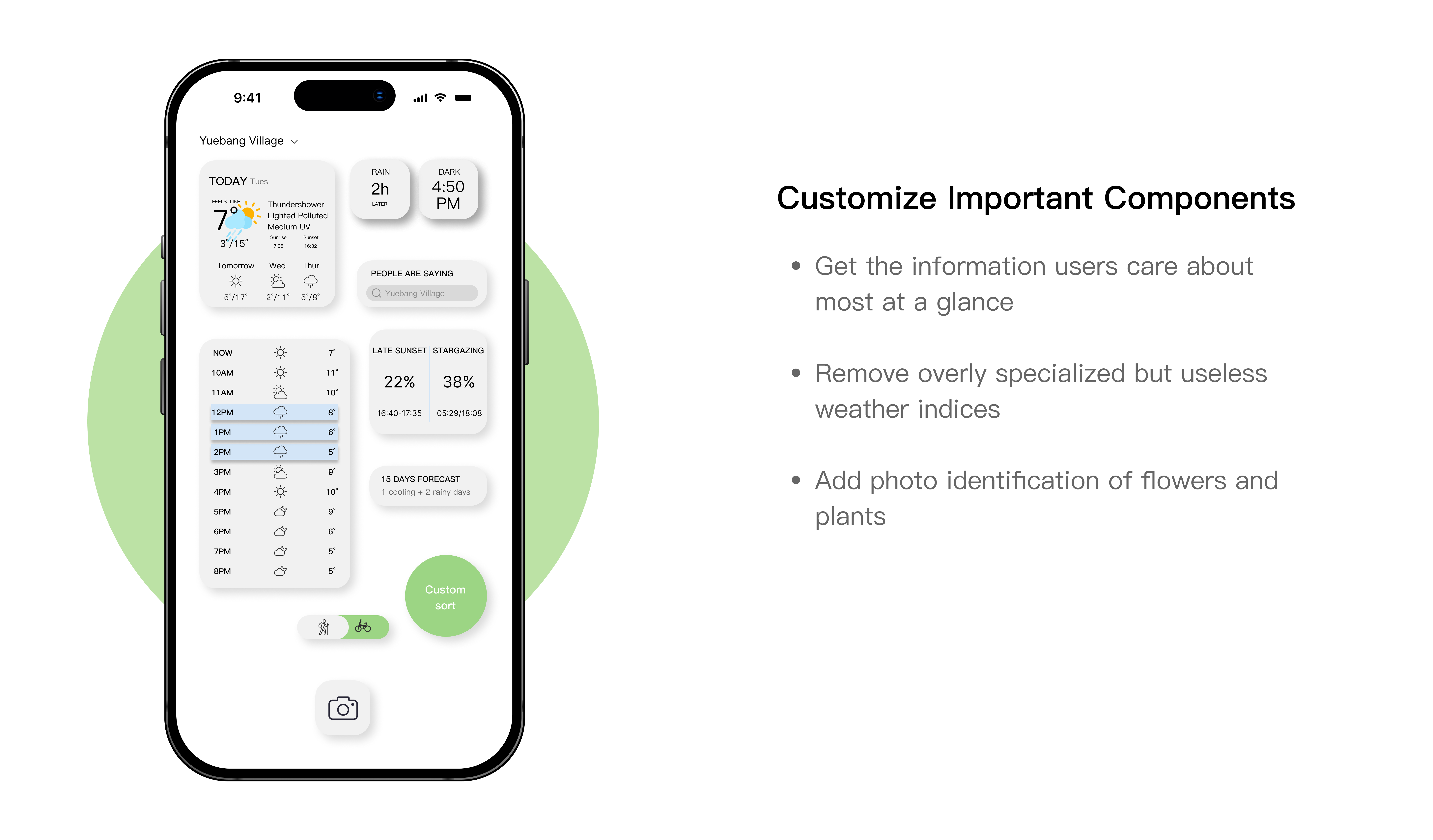
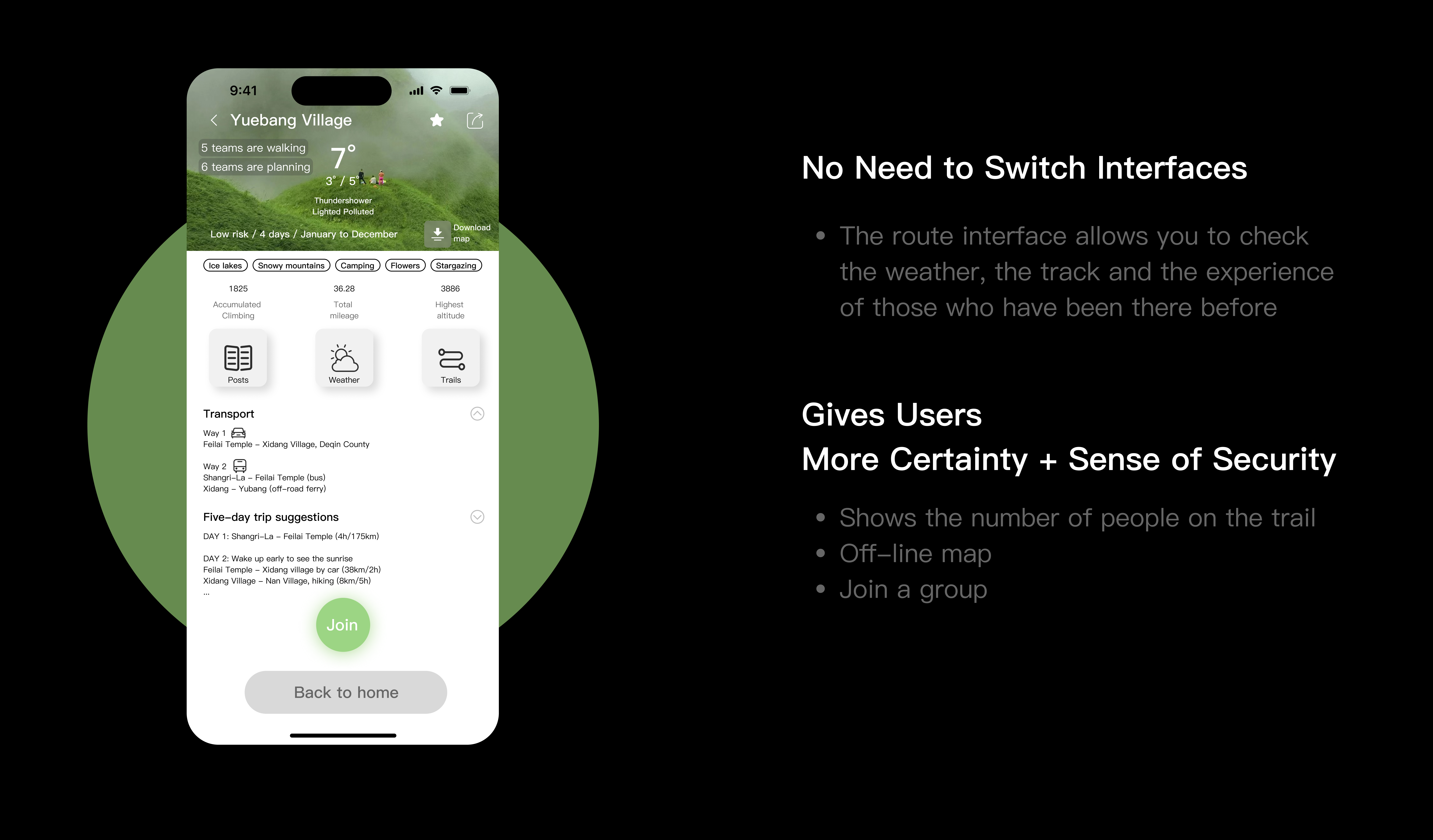
Project 3 focused on the 5C model of Conceptualize and Create. As I wanted to design a practical weather app for mountain sports enthusiasts, I put a lot of effort into understanding this user group. I wanted to add and simplify some weather information specific to their activities to improve their safety in the outdoors. For this project, I first tried to select the most frequent words from their travelogues as data for the survey. I then used the wireframe technique as an idea for a prototype map. Most of the feedback I got during the critique phase did not convince me, so I did not iterate on the prototype many times.
Project 4 was to carry out all the stages of the 5C model. The theme of this project was a street art app and the user group I chose was street artists. The particularity of this project was that it needed to be not only functional but also novelty, so I read the theories of emotional design. The final product is a high-fidelity prototype.
Interpret
The 5C model helped me to clear my mind during the 4 projects in the first semester, which should be user-centred rather than the designer’s preference. I have gained a lot of new insights in the last few months. Firstly, I would like to talk about user research, which required legwork.
I had never before thought of spending weeks collecting and understanding user behaviour, let alone talking to them face to face. The real data blew me away. For example, for my first project, I thought I knew bathhouses well, and before research, I had deduced from my experience that retired women and men talking business would be the main users. But from the photos I took of the bathhouse and the conversations I had with the staff, I knew that 70% of the most valuable user group were young families. The reason why most of the children are under the age of 7 is that the time of these families is not yet taken up by the education of their children. This made me realise that in-depth user research is very important for further research.
Another thing that struck me was that it is very difficult to make user interviews real. Feedback from users does not always reflect what they want, people don’t like telling you something. For example, PACT analysis and Personas provided me with direction to add to the information, and Personas contain pain points and goals that are key to analysing users.
What I learnt from Project 2 was to generate as many ideas as possible without thinking about the feasibility of following them up. Visual brainstorming is an effective way to generate ideas continuously.
I then learned in Project 3 to provide early visualisation through wireframes to quickly iterate and lay the foundation for later products. By focusing on user interaction scenarios and user experience, wireframes are great for explaining concepts and gathering feedback from users, while avoiding costly bad decisions.
The design goal in Project 4 was to create an app that engages the user, and emotional design was an effective solution. By considering ‘wow-experience’ to create an emotional connection with users, I translated the categories of street artwork into lift buttons for each floor. This idea also became the favourite part of the user test.
Evaluation
In my undergraduate course in UI design, I used apps that were highly downloaded from the App Store as a reference. At that time my design thinking was monetization-driven, it seemed that insight was not the most important thing, adding paid features and attention economy was the priority, and I was confused about the criteria of good and bad app design. To put it mildly, the UI and comprehensive features of messy were really poor. My limitations are also reflected in the fact that I am overly concerned with the best looking, and as long as I am not satisfied, I will keep revising. This resulted in subsequent stages not going ahead at all and no final output.
The biggest change I made during this semester was that I intentionally forced myself to iterate based on the 5C model and real data to avoid blindly relying on my preferences for design, which played a big role in the practicality of the final product.
After this semester I am more focused on thinking and being logical. Am I helping the user? Do users care about these changes? Is this good for the long-term development of the product? Is the current product logic sustainable? These questions largely prevented me from designing a product that was only the best looking.
Another strong point is about critiques: critiques work best in person. I was somewhat arbitrary in choosing the people who tested my products, which led to me not receiving effective feedback.
To this day my dyslexia persists. I want too much for a text to be full of sentences that are interesting or thought-provoking enough that I give up reading it when I’m not interested. It was difficult for me to read my way to fresh knowledge. I found listening to some UX podcasts to be a better way to focus my attention than watching. So I started to listen to podcasts and take notes in my notebook and found that some of the quality podcasts gave me quick access to information that was useful to me, which was far more exciting than reading an article and not remembering anything. For example, one of the UX Coffee podcasts was on Dark Pattern and I realised that trick questions can make for a bad user experience and I will be aware of these in my design.
The last point is a new understanding of ‘conservative’ design, which doesn’t mean it’s not good. In projects 3 and 4 I tried to be ambitious and find new needs to design an original app, but after analysis and reflection, I was often disappointed to find that the needs created were not needed and that the old me had probably decided to design for these ‘pseudo-needs’. This obsession came up when I was reading Ish’s tweets and he mentioned a new book, 77 Things (an internal read from a Google Bay View company in 2018), which says ‘Your design doesn’t need to be surprising. More often than not, your design should simply complement existing behaviours, existing wants, or existing needs in the most elegant way possible. One step at a time. Don’t be fooled by the gleam of originality.’ So I found that using competitive analysis is a good way to refine existing apps.
Plan
There is a lot I want to learn about UX design, such as learning about Figma effects and teamwork, making the presentation of app effects more intuitive and appealing, as well as easy to explain to users and stakeholders.
I think that shortly I will join a Chinese internet company as a UX designer, and the reality of the job will probably be very different from the design thinking I learnt in my postgraduate studies. In terms of design itself, Chinese typography, colour preferences and business complexity, app design in China is inherently more difficult than abroad. Most of the time I have to follow what the project manager wants, open up the Figma and draw the wireframe and get busy in one rushed iteration after another.
My solution to this is to understand the business structure and long-term design framework of these internet companies before I look for a job, to ease the psychological burden. I also plan to work on my small talk skills.
Finally, I would like to use Google’s ‘Don’t be evil’ from 2017 and change it to ‘Let’s be an angel’ to motivate myself.
Bibliography
Christensen, T. (2016) Peek Inside a Facebook Design Critique.
Available at: https://medium.com/designatmeta/peek-inside-a-facebook-design-critique-c4833efda26e
(Accessed: 19 Jul 2016)
Teixeira, F. (2017) Asking the right questions during user research, interviews and testing.
Available at: https://medium.com/user-experience-design-1/asking-the-right-questions-on-user-research-interviews-and-testing-427261742a67
(Accessed: 21 Mar 2017)
一杨ish (2019)’77 Things’[Weibo] 3 January.
Available at: https://weibo.com/u/6375760521?is_all=1
(Accessed: 6 Jan 2023)